Monday, December 30, 2013

Happy New Year

Is it better to be right or be happy? A British Medical Journal report investigates this research question in their lighthearted Christmas issue. The research sample consisted of one married couple (n=2). The female was blind to the null hypothesis being tested: it is better to be right than happy. The female was assigned the "right" condition. The male was assigned the condition of agreeing with the female's "every opinion and request without complaint." Happiness was measured on a 10 point Likert scale labeled Quality of Life. Unfortunately this study was terminated early because of "severe adverse outcomes." The males Quality of Life fell 4 points in 12 days, whereas the female's Quality of Life increased slightly from 8 to 8.5. The researcher's findings: "The results of this trial show that the availability of unbridled power adversely affects the quality of life of those on the receiving end."

Be nice in the new year and be happy.

Monday, December 23, 2013

Probability of a White Christmas


The map above is the current snow cover (as of 13 December 2013) in the US according to the weather.com. Compare this to National Oceanic and Atmospheric Administration map from the last few years of Christmas morning snow cover over the last five years.
Combining such maps from 1908 to 2010, NOAA maps out the probability of a white Christmas (that is, 1" of snow on the ground).


They also have a report from 1995 that maps the probability of 1", 5", or 10" of snow on Christmas morning.

Except for the Northeast, a many of the areas of the greatest chances are not densely populated. 
I wonder, what is the expected percentage of the US population that experiences a white Christmas?

Happy Holidays.


Monday, December 16, 2013

Scatterplot Waldo

Slate.com staff writer Ben Blatt has examined the wide range of Where's Waldo picture books,
looking for a useful search strategy to find Martin Handford's elusive cartoon character. Blatt plotted the horizontal and vertical page location of Waldo in 68 pictures in, what he calls, the seven "primary" Where's Waldo books. He claims to have sat for three hours with a tape measure in a Barnes & Noble bookstore and measured Waldo's location on each 20" X 12.5" two-page spread. The image above shows these locations and two horizontal bands of 1.5" each: one three inches from the bottom of the page and the other seven inches from the bottom. Blatt found that Waldo can be found in these bands in 53% (36) of the 68 images.

We can see the higher frequency of occurrence in bands by finding the marginal histograms from digitized locations in Blatt's scatterplot (data shown below). Here is the marginal histogram of the vertical locations of Waldo. The regions found by Blatt stand our prominently in the two modal peaks in the histogram.
Horizontally there is a less prominent patten of the locations across the two-page spread.
Perhaps we could improve on the two-vertical-strips strategy by concentrating on the far left and far right of the two-page spread with then a glance just left of center?
Here are the data:
horizontal vertical horizontal vertical horizontal vertical horizontal vertical
1.02 11.97 9.52 7.21 11.79 6.22 8.8 2.95
7.78 10.22 10.51 7.71 14.78 5.72 12.57 3.71
8.51 9.99 11.52 7.97 14.51 4.96 17.76 3.97
9.26 9.46 11.29 6.95 18.03 5.43 18.03 4.21
10.77 10.48 12.19 7.77 18.75 5.43 19.01 4.47
11.99 11.48 12.51 8.24 1.8 3.97 16.81 2.95
13.27 10.48 12.51 7.48 1.31 3.45 1.04 2.72
16.26 11.21 14.51 8.21 2.26 3.18 1.54 1.93
19.48 12 14.25 7.21 3.77 4.21 1.54 1.43
16.26 9.99 15.62 7.48 3.51 3.45 3.28 1.2
17.5 9.99 17.24 7.48 3.8 3.45 7.29 1.93
17.74 9.46 18.49 7.21 5.31 3.97 8.27 1.2
15.5 8.97 19.25 7.48 4.79 2.98 8.53 0.44
5.78 8.24 2.76 6.75 5.54 3.21 10.54 2.45
6.76 7.97 3.8 6.98 6.76 4.44 17.5 2.69
7.52 8.47 3.28 5.96 8.27 4.21 19.48 2.45
8.51 8.47 5.54 6.72 9.03 3.45 18.98 1.93


Monday, December 9, 2013

Scatterplot Artists

Here is a scatterplot of writers placed, very subjectively, by J. Chen at htmlgiant on scales of Mediocrity to Genius on the horizontal axis and Modesty to Arrogance on the vertical.  Some eclectic combinations along straight lines: Tom Wolfe, John Updike, T.S. Eliot, Jonathan Swift(?), and D.F. Wallace along a line of decreasing arrogance and increasing genius. He's also produced similar scatterplots for musicians: rappers and rockers (+Miles Davis?). For the writers, those that are Mediocre and Modest appear under-represented in his evaluation. Perhaps not surprising for writers, but check out his third quadrant for rappers.
This type of scatterplot is regularly published in the New York Magazine. Last year, the actress Meryl Streep was treated to a scatterplot that place her various movie roles on the axes from Cold to Warm and Frivolous to Serious.

And here's another from New York Magazine for Bruce Willis.
And in 2001 Newsweek magazine did the same for TV shows. For several years I referred to this in my lecture on scatterplots for Basic Statistics students. Of course, it's quite dated now. My current students were six years old when these shows were on TV!


Friday, November 29, 2013

Looking at Literary Lives

Here is a graphic showing  the event history in the literary careers of famous 20th century authors. It was produced by the design firm Accurat for one of my favorite blogs Brain Pickings. (click here for the image for all the authors). 
 As the legend indicates, begin at an author's birth (at noon on the top of the circle) then move clockwise (around to midnight) representing an elapsed time of 100 years. Triangles are drawn connecting notable events in these literary lives (birth, publication(debut, masterpieces), and death). Authors' ages at their debut mark the vertex of one triangle (with birth and death). Ages, at the publication of  of their masterpieces, are marked by the vertices of other shaded triangles. For many authors, their careers are displayed as a single triangle, showing that their masterpiece was their debut work. Others have several notable works, represented by overlapping shaded triangles. This provides a stylish depiction of these literary lives. But a long-lived author with a lone, early debut masterpiece (e.g. Norman Mailer) might have a triangle of the same size as one whose notable life was cut short (e.g. Jack London). Our eyes/minds are drawn to the sizes of the triangles. What are we to learn from the most central feature of these displays?


Monday, November 25, 2013

Transitions

Thanksgiving is this week, now through Christmas is the most heavily traveled period of the year. It brings to mind how mobile the US population is. Not just for holiday travel, but even for places to call  home. Americans are restless and we move.

Here is a clever interactive graphic illustrating this from data journalist Chris Walker and his site Vizynary (also posted by Wired.) The flows of migration from one US state to another are shown as arcs drawn between two states if at least 10,000 people moved between them in 2012. The width of the arcs indicate the frequency of migration along that path. The data came from the U.S Census American Community Survey. Interactively you can select a state and see the arcs of migration flow to other states. It reminds me of blasts of fireworks. Very well done.

Monday, November 18, 2013

Normal Snare Distribution

Here is the head of a snare drum (thanks Sean) showing the two dimensional, joint distribution of his drumstick hits. The maker, Evans, produces drum heads with two plys of plastic bonded together. In this image the pattern of wear and use reveal themselves through contour lines as closed curves indicating regions of similar frequency of use. The greatest wear is in the lightest colored central region, having seen the greatest frequency of hits. This central region has worn through the first ply showing the remaining plastic support underneath. Sean seems to have a very stable left hand, consistently hitting this small central region in nearly a circular pattern. In this region, the horizontal location of his hits seems independent of the vertical, producing this near circular pattern of the joint distribution. Surrounding this is the darker region of the top ply of plastic. This layer retains more dirt and grime than the underlying supporting plastic. Again the pattern of these hits is nearly circular. It turns out that with simple assumptions, like radial symmetry and independence, the pattern can be shown to be that of a bivariate normal distribution. A result that was thought first published (p. 398) by John Herschel in 1850, but actually discovered much earlier by the American mathematician Robert Adrain in 1808. More details on that in a future post.

But here, perhaps we see slight deviations from normality. The darker ring seems to show slightly  more variability extending vertically and a greater clustering of hits on the bottom of this image. This indicates a bit of skewness towards the top of the picture. Less use and wear is finally shown in the cream colored outer region that has seem very few hits. Thanks again Sean.

Monday, November 11, 2013

Top of the Heap? Mediocre Still

Here is a cartoon from Rhymes with Orange. A student looking at a bell-curve of SAT scores says, "My strategy? Shoot for the top of the bell curve. Then I can look down on everybody." The student clearly has the wrong idea. He seems to think that the peak of the bell curve puts him on the top of the heap. For him, higher on the curve is better than everyone. This mistake we've seen before in this blog here and here. But just perhaps the cartoonist, Hilary Price, has the idea of the bell curve correct. She shades in the letter C on the side. Rather than seeing this as an illustration of the student's multiple choice answer to an SAT question we could imagine that she has assigned to the student a score of C, a traditional average grade, that would be the most common or the most likely grade. This is exactly what the height of the bell-curve represents for such a mid-range grade. The bell curve is tallest for the most commonly occurring grades, not for the highest grade one might strive for. That grade is at the extreme right, where the curve is low. As we've seen before the "Top of the heap is mediocre."

Monday, November 4, 2013

Correlation Ellipse Matrix

Here is an informative graphical representation of the correlation matrix of a data set of weather data on 16 variables. The image is via the RevolutionAnalytics blog and their post on big data available in R. The data mining R package Rattle produced the image. The magnitudes of correlations are shown with a concentration ellipses. Blue ellipses, with positive slopes, display variables with positive correlation with darker blue shading depicting higher positive correlation and lighter blue shading depicting lower positive correlation. Near zero correlations are shown as open, unfilled ellipses that are nearly circular. Variables with negative correlation are shown similarly by red ellipses with negative slopes. Dark red shading depicts greater negative correlation and lighter red shading depicts negative correlations closer to zero. This is a very useful tool to guide the eye through the relationships of the many variables used. Of course, as is well known, correlation is only an appropriate measure of the strength of the linear relationships between two variables when their scatterplot shows approximately the elliptical shape shown in these shaded icons. Examples abound of scatterplots where representing them as above can be misleading. My favorite, below, from the book by Chambers, et al. shows eight scatterplots all with the same positive correlation of 0.7. Correlation and its representation with an ellipsoidal icon is appropriate for only one of these scatterplots. This extols us all to remember, to look at the data.


Monday, October 28, 2013

Six Decades of Most Popular Girls Names by US State

Animated maps showing the most popular girls names from 1960 to 2012. There are some quick country-wide shifts from one year to the next. Consider Lisa in 1969 and Jennifer in 1970.

Monday, October 21, 2013

Best American Infographics of 2013

The Best American Infographics of 2013, a new book compiled by Gareth Cook, has an introduction by David Byrne. Byrne says a good infographic is "elegant, efficient, and accurate," but also revealing when they can "engender and facilitate an insight." The book is such a collection. Here is one showing the frequency distribution of births throughout a calendar year.
And another showing how the DNA analysis of canine genes cluster into four broad categories of dogs.
The video above gives more examples. It's easy to get engrossed in this elegant and insightful book.


Monday, October 14, 2013

Central Limit Rabbits

A cute video illustrating the Central Limit Theorem in a "Creature Cast" by animator Shuyi Chiou via the New York Times. Here a normal distribution is presented correctly. On the horizontal axis is a number line of the weight of rabbits. Small rabbits are on the left and large rabbits are on the right. A smooth curve of their relative frequency of occurrence is also shown. The curve is low on each end indicating that at each extreme there are few small rabbits and few large ones. The curve is high in the middle where the relative frequency of average weight rabbits is large. In this case, the population distribution of rabbit weights appears to follow a normal curve. In previous posts, we have seen this number line aspect of such a normal curve indicated correctly and also incorrectly.

In illustrating the Central Limit Theorem the animation goes on to examine the average weight of groups or samples of rabbits.
Such average weights of samples builds up the sampling distribution of these averages. The Central Limit Theorem tells us that these group averages will more closely follow a normal distribution as the group size increases. An illustration starting with the bi-modal distribution of dragon wings is also shown.

Monday, October 7, 2013

Little Fruit Punch Love

A soft drink dispenser on campus shows the ranking of student tastes. In order of the wear resulting from their frequency of use: Coca-Cola, Diet Coke, Fuze Sweet Tea, Sprite, Fanta Orange, and the little used HiC Flashin' Fruit Punch.

Monday, September 30, 2013

The Secret's Out

Great security! Too much wear can be a bad thing. From cheezburger.com, thanks Laura.

Monday, September 23, 2013

Simpson's Paradox

Simpson's paradox fools many. Percentages can favor women over men across each of several subgroups but then reverse, favoring men over women when the subgroups are combined into one. At one level this seems illogical. We seem to expect that patterns observed consistently for portions of a whole should also apply when the portions are aggregated together into one. This simple view misses lurking variables. In a famous example, graduate admission to Berkeley seemed biased against women when considered overall, but when the admissions were considered by individual departments there was no bias or bias in favor of women. The lurking variable is that "not all departments are equally easy to enter." and "the proportion of women applicants tends to be high in departments that are hard to get into and low in those departments that are easy to get into".

Lewis Lehe and Victor Powell at UC Berkeley have produced interactive applets to illustrate Simpson's paradox. As Flowing Data mentions "Sometimes when you zoom in, you see a completely opposite trend of what you saw overall".

We've considered Simpson's paradox before where even microbes can be used to illustrate it.


Monday, September 16, 2013

Top of the Line

Upscale neighborhood. Greatest frequency of wear is on the premium.
Forwarded by a colleague (thanks Jun). Originally, I think, from Reddit.

Monday, September 9, 2013

Probability WONK

.
Robert Jernigan WONK Challenge from American University on Vimeo.
I finally saw my American University WONK Challenge Spot on the Jumbotron at the Washington Nationals game on August 27. Here's me pointing, and the Nationals won!
Foul balls have really hit the news lately with a fan in Cleveland catching 4 in one game this last month! As I mention in the spot some put the probability of catching a foul ball in any game at about  1 in 1000. This, of course, varies with where you sit. Defending or attacking this figure was not possible in such a short spot, so if we accept it, we compute the probability that you catch at least one foul ball in say, n, games. We can compute this probability by first finding the probability of its complement.  The complementary event of catching at least one foul ball is catching no foul balls. In one game our chance of not catching a foul ball is 1-0.001=0.999. If our catching a foul ball is independent from game to game, then our chance of not catching a foul in n games is (0.999)n. Subtracting this from one, we get the probability of catching at least one foul ball in n games: 1- (0.999)n. If we want this result to be at least 50-50 (that is, 0.50) we need to find the value of n so that: 0.50 < =1- (0.999)n. You can do this by trial and error on a calculator or by using logarithms to solve for n. This will be the number of home games you must attend to increase your chances of catching at least one foul ball to at least 50-50. Now convert this to seasons of home games. There are 162 games in a season, but only 81 are home games. You should get an answer of 8 home seasons plus about half of a ninth season, hence choice B in the video.

This was fun to do.

Monday, September 2, 2013

Wear Pattern in "Bedrock"

This is a symmetric and bell-shaped pattern of wear on the entry door to the restrooms at Rocky Gap Casino and Resort in Flintstone, MD (yes, Flintstone). We've seen this type of wear often, for example, here and here. People use the handle to open and pass through door, but many, likely on exit, place their hands around the edge of the door to pass through or hold it open for others. They can't reach too high and when they do it seems only fingers are used, leaving little wear.  It's also  uncomfortable to hold it open too low, again likely only with fingers. So most of the wear and likely many whole hands are used between these extremes causing much more wear. Top to bottom, little use, greater use, then little use generates the bell-shaped pattern wear.

Monday, August 26, 2013

Monday, August 19, 2013

Variance Rules

[Earlier this post had errors. Thanks Kevin. I was thinking sequentially instead of group-wise.  For correct reference, my mistake is corrected here. The overall conclusions have not changed.]

An interesting probability paradox from Futility Closet who credits Gábor J. Székely’s Paradoxes in Probability Theory and Mathematical Statistics via's Mark Chang’s Paradoxes in Scientific Inference.

Variance in a jury's judgement seems to be better than taking one person's word for it. As Futility Closet mentions:
Chang writes, “This paradox implies it is better to have your own opinion even if it is not as good as the leader’s opinion, in general.”
From Futility Closet consider:
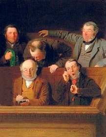
"A, B, C, D, and E make up a five-member jury. They’ll decide the guilt of a prisoner by a simple majority vote. The probability that A gives the wrong verdict is 5%; for B, C, and D it’s 10%; for E it’s 20%. When the five jurors vote independently, the probability that they’ll bring in the wrong verdict is about 1%".
For such a 5 member juries the possibilities are: mistaken=1, correct=0:
 
A    B    C    D    E        P(A)    P(B)   P(C)   P(D)   P(E)   Product
1    0    0    0    0        0.05    0.9    0.9    0.9    0.8    0.02916
0    1    0    0    0        0.95    0.1    0.9    0.9    0.8    0.06156
0    0    1    0    0        0.95    0.9    0.1    0.9    0.8    0.06156
0    0    0    1    0        0.95    0.9    0.9    0.1    0.8    0.06156
0    0    0    0    1        0.95    0.9    0.9    0.9    0.2    0.13851
1    1    0    0    0        0.05    0.1    0.9    0.9    0.8    0.00324
1    0    1    0    0        0.05    0.9    0.1    0.9    0.8    0.00324
1    0    0    1    0        0.05    0.9    0.9    0.1    0.8    0.00324
1    0    0    0    1        0.05    0.9    0.9    0.9    0.2    0.00729
0    1    1    0    0        0.95    0.1    0.1    0.9    0.8    0.00684
0    1    0    1    0        0.95    0.1    0.9    0.1    0.8    0.00684
0    1    0    0    1        0.95    0.1    0.9    0.9    0.2    0.01539
0    0    1    1    0        0.95    0.9    0.1    0.1    0.8    0.00684
0    0    1    0    1        0.95    0.9    0.1    0.9    0.2    0.01539
0    0    0    1    1        0.95    0.9    0.9    0.1    0.2    0.01539
0    0    1    1    1        0.95    0.9    0.1    0.1    0.2    0.00171
0    1    0    1    1        0.95    0.1    0.9    0.1    0.2    0.00171
0    1    1    0    1        0.95    0.1    0.1    0.9    0.2    0.00171
0    1    1    1    0        0.95    0.1    0.1    0.1    0.8    0.00076
1    0    0    1    1        0.05    0.9    0.9    0.1    0.2    0.00081
1    0    1    0    1        0.05    0.9    0.1    0.9    0.2    0.00081
1    0    1    1    0        0.05    0.9    0.1    0.1    0.8    0.00036
1    1    0    0    1        0.05    0.1    0.9    0.9    0.2    0.00081
1    1    0    1    0        0.05    0.1    0.9    0.1    0.8    0.00036
1    1    1    0    0        0.05    0.1    0.1    0.9    0.8    0.00036
0    1    1    1    1        0.95    0.1    0.1    0.1    0.2    0.00019
1    0    1    1    1        0.05    0.9    0.1    0.1    0.2    0.00009
1    1    0    1    1        0.05    0.1    0.9    0.1    0.2    0.00009
1    1    1    0    1        0.05    0.1    0.1    0.9    0.2    0.00009
1    1    1    1    0        0.05    0.1    0.1    0.1    0.8    0.00004
1    1    1    1    1        0.05    0.1    0.1    0.1    0.2    0.00001


All those possibilities in red are mistaken coalitions with probability totaling:  0.00991.
[This is slightly smaller than the result originally posted which over-estimated this value as a comment suggested.]


From Futility Closet:
"But if E (whose judgment is poorest) abandons his autonomy and echoes the vote of A (whose judgment is best), the chance of an error rises to 1.5%".
In this situation juror E always agrees with juror A, so if A is included in a mistaken coalition it only needs two more jurors to form a simple majority. Of course A might not be included, then a mistaken coalition needs jurors B, C, and D. The possibilities and their probabilities are shown below:

A    B    C    D        P(A)    P(B)   P(C)   P(D)   Product
1    0    0    0        0.05    0.9    0.9    0.9    0.03645
0    1    0    0        0.95    0.1    0.9    0.9    0.07695
0    0    1    0        0.95    0.9    0.1    0.9    0.07695
0    0    0    1        0.95    0.9    0.9    0.1    0.07695
1    1    0    0        0.05    0.1    0.9    0.9    0.00405
1    0    1    0        0.05    0.9    0.1    0.9    0.00405
1    0    0    1        0.05    0.9    0.9    0.1    0.00405
0    1    1    0        0.95    0.1    0.1    0.9    0.00855
0    1    0    1        0.95    0.1    0.9    0.1    0.00855
0    0    1    1        0.95    0.9    0.1    0.1    0.00855
0    1    1    1        0.95    0.1    0.1    0.1    0.00095
1    0    1    1        0.05    0.9    0.1    0.1    0.00045
1    1    0    1        0.05    0.1    0.9    0.1    0.00045
1    1    1    0        0.05    0.1    0.1    0.9    0.00045
1    1    1    1        0.05    0.1    0.1    0.1    0.00005


All those possibilities in red are mistaken coalitions with probability totaling:  0.0145.
[This is slightly smaller than the result originally posted as a comment suggested.]
Again from Futility Closet:
"Even more surprisingly, if B, C, D, and E all follow A, then the chance of a bad verdict rises to 5%, five times worse than if they vote independently, even though A is nominally the best leader".
Variance is good!

Monday, August 12, 2013

Plastic Feet Peaks


Here is an example of a remarkably symmetric pattern of wear and use, but most assuredly not bell-shaped. The pattern on the top of this trash bin shows two prominent areas of wear at the left and right side of the opening. These two areas show greater wear than a large fairly uniform area of use in the center between the peaks. The two extreme areas of use tell us something about the modes of customers’ and restaurant workers’ actions.

Fast food is often delivered on plastic serving trays. As diners leave, they collect the assorted packaging and wrappings from their meals and deposit them in the trash bin near the exit. The diners then return their serving trays to the top of the trash bin. The plastic trays have small raised ridges on bottom of each corner. These small ridged “feet” act to provide a tiny gap between stacked trays to make them easier to separate.

When the top of the trash bin is empty, trays are returned by sliding them back along the front edge of the bin. The plastic feet on the bottom of the trays scrape along the top of the bin. This leaves prominent peaks in the wear pattern on the bin. As the trays are slid further the central portion of the trays sag and also scrape the bin to produce the pattern of use showing almost uniform wear between these two peaks.

Of course we would expect to produce this type of wear mainly when the top of the bin is empty, allowing the sliding tray to wear down the top. Later trays may not produce any wear along these edges if they are just placed on top of trays already in position. But here is where the restaurant’s workers contribute to the pattern.

After awhile, the trays stack up and must be returned for, what is hoped, a good washing. As they are retrieved, the pile of trays is slid forward to be picked up. This produces the uniform center wear and the peaks along the right-hand and left-hand edges as the trays and their feet again scrape the top of the bin. These actions produce the pattern of nearly equal left and right peaks of use with more uniform wear in between, resulting in a symmetric, but bi-modal frequency distribution.

Monday, August 5, 2013

Earliest Living Histogram Revisited (and Reversed)

While preparing for my talk at the Joint Statistical Meetings in Montreal this week, I had the occasion to consider again the Earliest Living Histogram that I posted in 2008. This image appeared on page 450 of Popular Science Monthly, September 1901 in a paper "The Statistical Study of Evolution," by C.B. Davenport. Forty University of Chicago students are arranged by height in bins of two inch width. When viewed from above we see what was much later called a "living histogram" of the heights of this sample of men.  It is described in more detail in Graphical Methods for Presenting Facts (1914) (Figure 141) by W.C. Brinton where, on page 165, he writes:
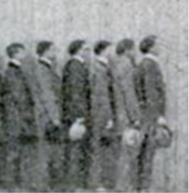
In Fig. 141 a group of men have been arranged in different rows. There is only one man in the shortest class at the left, and only one man in each of the tallest two classes at the right. Most of the men are of that height shown by the row to the right of the center of the diagram. A glance at the photograph taken looking down on this group of men shows that there are more men shorter than the most frequent height than there are men taller.
Davenport's original publication of this photograph also contains another image of the forty students:
Davenport says they are "arranged (approximately) in order of height." Examine the tallest few students shown here:
Note the shading of the hats that the tallest five men are holding: Gray, White, Black, White, and Black, reading from tallest downward (right to left). Now consider their arrangement in classes by height in the image above. Note that the five men on the far left are now wearing hats with shading Gray, White, Black, White, and Black.

The histogram image is reversed!

The taller men are shown on the left and the shorter on the right. This is exactly the reverse of the description given by Brinton and it reverses his reasoning and conclusions about the frequency of tall and short men in this sample. But there is more evidence. Reversing this image along a properly oriented and indicated number line we get the image below along with counts of the men standing in two of the histogram classes.
The five numbered men in dark hats, on the right, stand in a row of about the same extent as the seven numbered, smaller men in the row on the left. The men on the right are not just taller but also broader, and the smaller men on the left take up much less space in this regard. Another indication that this is the proper view of this histogram. The original published histogram should be reversed.
The correctly oriented Earliest Living Histogram is shown below:


Monday, July 29, 2013

Shop Worn

This is the checkout counter of the gift shop at the Mansion at Strathmore part of the Strathmore Arts Center in Bethesda, Maryland. The gift shop has seen many patrons. Standing to pay for purchases they rub against the edge of the counter. This results in a region of more centrally located wear with less wear extending to the right and left. Yet another, common, bell-shaped distribution pattern of wear. Here's another view.


Monday, July 22, 2013

Things Shouldn't Be So Hard

Here is "a worn-out place" where restaurant servers stand to collect plates and silverware to set up the tables for new patrons. Many feet have stepped, dirtied, or worn away these kitchen floor tiles. More wear at a central target and less wear towards the edges. This is a frequency patten that we have seen often.

It brings to mind the poem "Things Shouldn't Be So Hard," by former US Poet Laureate and MacArthur Fellow, Kay Ryan (via the NYTimes). Considering all the worn and marked things we have illustrated in these postings, Ryan's poem could be the defining wish for this blog.

THINGS SHOULDN'T BE SO HARD
A life should leave
deep tracks:
ruts where she
went out and back
to get the mail
or move the hose
around the yard;
where she used to
stand before the sink,
a worn-out place;
beneath her hand
the china knobs
rubbed down to
white pastilles;
the switch she
used to feel for
in the dark
almost erased.
Her things should
keep her marks.
The passage
of a life should show;
it should abrade.
And when life stops,
a certain space—
however small —
should be left scarred
by the grand and
damaging parade.
Things shouldn't
be so hard.

Monday, July 15, 2013

Home Advice Lacks Skewness

I recently saw this TV commercial for Home Advisor a website that helps homeowners find home improvement professionals. The homeowners then report their costs for the repairs. The site displays a symmetric bell-shaped curve to show the distribution of these costs, irrespective of the shape of their actual distribution. The image above shows that the average cost for cleaning gutters is $180 and that "most homeowners" spent between $158 and $202. These values appear to mark the locations of  the inflection points for the curve. If we assume the curve describes a normal distribution of costs, these points lie at one standard deviation above and below the mean. Indicating that the standard deviation is $22. For a normal distribution, about 68% ( the website's "most homeowners") spent within $22 of the mean of $180. The minimum cost of $90 is about 4.1 standard deviations below the mean. Its placement on the graph seems appropriate. But the maximum cost of $300 is about 5.5 standard deviations above the mean. Maximum costs for other services sometimes exceed 5 and even 6 standard deviations above the mean, but are placed symmetrically with costs at about 4 standard deviations below the mean. The symmetric graphic hides the right skewness that we should expect in almost any monetary variable that is only bounded below by zero.

It would be better to show the actual  histogram of costs perhaps with a superimposed curve like we have seen previously with GetMarketPrice or TRUEcar.

Monday, July 8, 2013

Happiness in Negative Space

This image is from an Institute of Contemporary Art, Philadelphia exhibit called The Happy Show by Stefan Sagmeister that just ended its tour at the Institute of Museum of Contemporary Art, Los Angeles Pacific Design Center. In this display, included in the exhibit, people were instructed to select one gumball from column that indicated their level of happiness (1 to 10). The bar chart of the happiness level of those that participated is shown in the negative space above each column, showing how many gumballs were removed. Median happiness here looks to be about a 7. We've seen a similar exhibit before.

Monday, July 1, 2013

Beall Shaped

The Beall-Dawson House in Rockville, Maryland is an 1815 Federal-style home built for Upton Beall, then Clerk of the Circuit Court. It has been owned since 1960 by the Montgomery County Historical Society. Almost 200 years of use has left its mark. Below is the wooden threshold leading into the home's main parlor. The threshold shows the pattern we have seen often, the most wear in the middle where the frequency of use is greatest, trailing off to lesser usage and wear at the edges. A bell- (Beall?)-shaped distribution of wear.