Two months ago the
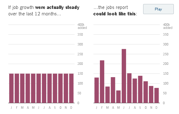
New York Times had a very informative visualization of monthly economic data with added variability due to sampling error. In the above screen shot we can see how repeated sampling variability can change a steady job growth graph to many different shapes of what it might have looked like with repeated sampling.
Here is another, an accelerating job growth graph and one possible result of the same graph with sampling variability showing very stable job growth, via
Statistical Modeling ... One commenter there notes how easy it is for us to reading meaning into random noise.


No comments:
Post a Comment