

Graphic from the print edition of the Washington Post on August 2, 2015 showing what proportion of a state's total electricity that comes from the burning of coal. Each state's circle represents 100% of the states electricity production. The inner black circle represents the percentage of the total electricity that is produced by coal. This is a nice display, but correctly interpreting such percentages from circles is difficult. Assessing "a lot" or "a little" is somewhat easy, but even correctly divining the 50% value, is something many find difficult and even counter-intuitive.
High school geometry likely taught you that an inner circle half the size of an outer circle is found by inscribing a square inside the outer circle and then inscribing an inner circle inside the square. This inner circle will have half the area of the outer circle.
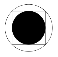
The geometry is correct, but visually interpreting this black circle as half the area of the outer circle can be difficult. Shaded areas of squares might have worked better in the coal graphic. The Washington Post has more maps on other methods of electricity generation here.
No comments:
Post a Comment